Church announcement slides you can read from the back row
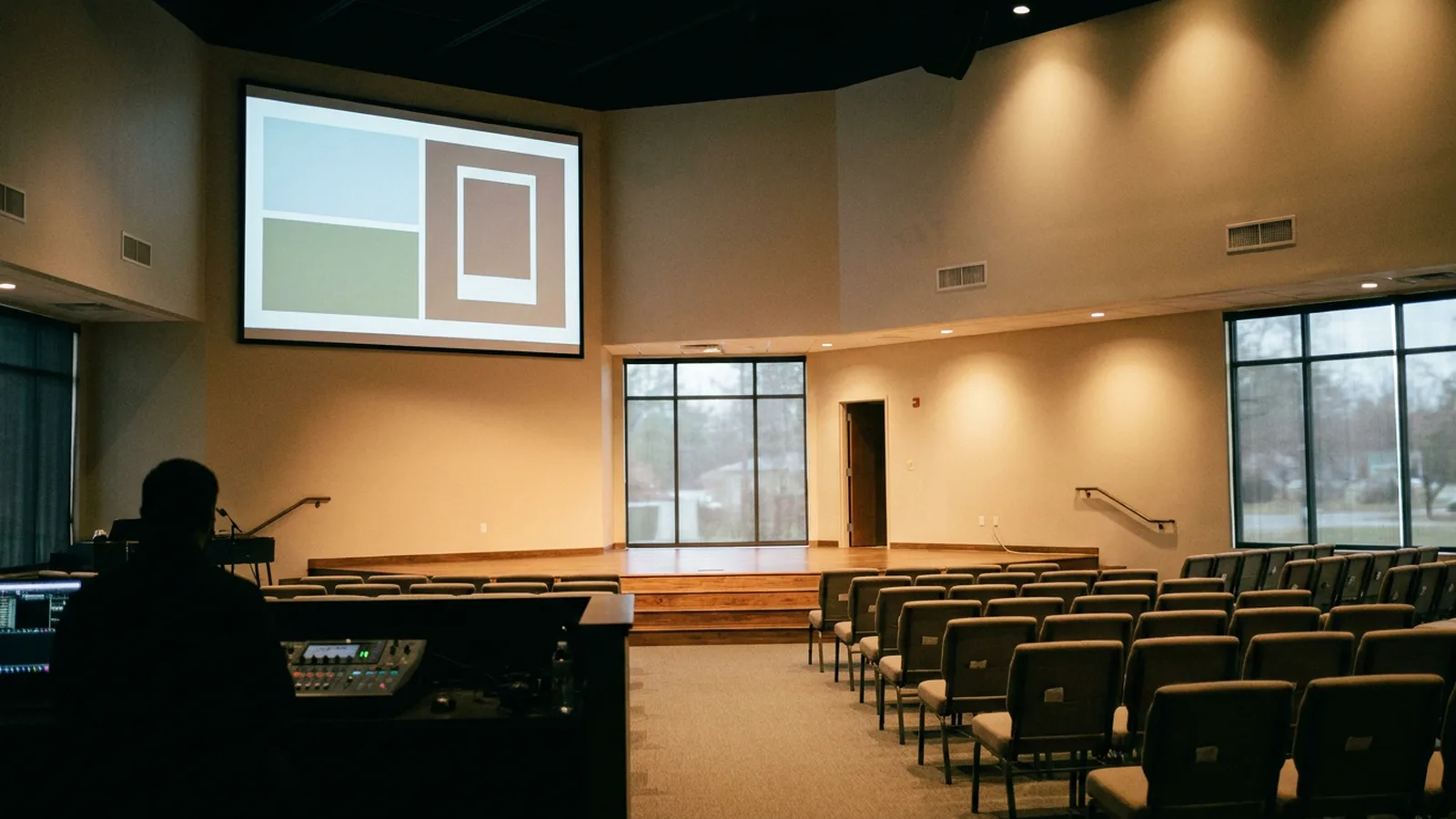
What to put on church announcement slides: one job per frame, a line limit, a contrast check, and a read-through before Sunday.
Published . Updated .
Put one job on each church announcement slide, and keep the copy to a maximum of four lines, with eight words or less on a line. Proofread each series two days ahead, with a second reader, before it reaches the screen.
That limit is from Vanco's slide guide. The point of the cap is speed. People are walking in, finding a seat, or settling a child. A paragraph on the screen is a paragraph they will not finish. Vanco says that cap makes the information easier to process and read quickly. A comment on the MediaShout ideas page says to speak only items that apply to 70% of the congregation or more, and to keep slide copy similar so each frame takes about the same time to read.
What belongs on the screen
The pre-service loop is a welcome for people who have not heard a word yet. MediaShout treats announcement slides as a lifeline for guests and a reminder for members, and it lists jobs that fit a frame:
- A short line of the church's mission, so a guest sees what this church is about before the welcome.
- How to join a small group: a name or an email, not a history of the ministry.
- Wayfinding. Nursery, restrooms, and the cry room, so a guest does not have to ask a stranger.
- The visitor's next step: a card, a person at a table, or coffee in a named room.
- Baptism, membership, or communion only when you need to say when it happens, who it is for, and who to talk to.
- One church-wide event, with the detail people need in order to show up.
- Where the church is active online, if you actually post there.
Staff biographies, overseas partner lists, and the outcome of last month's work can live in the loop only as a single line plus a place to learn more. MediaShout's own examples of those slides are useful ideas. They become unreadable when the frame tries to hold the whole story. The spoken list is a different cut. Church announcements is where we sort what deserves the microphone. The screen can keep a quiet frame up while that sort is still happening in the office.
A comment on the MediaShout page adds the handoff: cut the on-screen copy until it gets attention and gives the most-needed details, then point people to a printed bulletin or a staffed table. The goal is that each frame can be read in about the same amount of time. A supper slide that lists every dish will lose the room. A supper slide that names the night and the table will not.
How the frames should look
Use one calm set of colors across the loop. Vanco says the colors should look like they belong together, and that muted, earthy tones are easier to sit with than harsh brights. If people shield their eyes, they are not reading. Skip the hourglass wipe and the other transitions that were a novelty years ago. Vanco's advice is to change the look every few weeks so the loop stays fresh, rather than animating every frame.
Pick a typeface a guest can read without effort. Swirly script fails that test. Vanco says to stick with faces that look considered and are easy to read. Fuzzy type and soft photos fail the same way. Have the operator check the file on the actual screen, not only on a laptop, because a photo that looks sharp on a desk can fall apart on a large wall.
End each event frame with a specific action. Vanco's failure line is still "talk to Pat" if the room has not met Pat. Put a photo of Pat on the frame if you have permission, and offer a phone number or an email so a quiet person has a way in. Ask Pat first. A name on the screen is a promise that someone will answer.
Leave insider language off the frame. Vanco notes that a joke only a few people understand isolates everyone else, and that church jargon does the same work more quietly. "Fellowship hour" can be "coffee in the hall" on a guest frame. The members already know the nickname. The guest does not.
Match the tone of the church. A playful room can use a light frame. A quieter room should not get a joke pasted on because another church did it. Vanco says to ask seniors how they want to receive news, and to invite them into a church announcement video rather than assuming the screen is only for younger people. Kids' art as a background can work for one week if the words stay readable on top of it. Art that eats the type is decoration, not an announcement.
Contrast when the same frame goes online
A sanctuary projector is not a web page. When that frame also goes on the website or in the email, use the web rule as a floor. The W3C contrast minimum says text and images of text need a contrast ratio of at least 4.5:1, except large-scale text, which needs at least 3:1. The same note treats 18 point text, or 14 point bold text, as large enough for the lower ratio. Pale gray text over a busy photo, or a light title over a light sky, may fall below those ratios, so measure the contrast against the part of the background that sits directly behind the letters before the frame goes online.
In the room, the check is simpler and stricter than a ratio. Stand at the back row and read the event name. If you cannot, the type is too small, the photo is too busy, or the screen is too far. Church stage design is the next page when the problem is the screen's place in the room rather than the words on the frame.
The Vanco slide guide does not state a point size or a width in pixels. The Sharefaith announcement-slides page we opened is a catalog grid of 2457 matches and has no word limit. It shows themed backgrounds a church can buy. It is a picture catalog, not a wording guide. Use it as a picture source if you already use that library. Use the four-line cap on this page for the words.
For a social crop, keep the same event name, date, and one action, and drop everything else. Church social media post ideas covers how that still image should sit in a feed. Do not invent a second set of facts for the phone.
Read it in the room before Sunday
Vanco's quality pass is practical. Two sets of eyes. Proofread two days ahead so a wrong time can still be fixed. Check that the date, the room, and the contact match the bulletin. A frame that disagrees with the printed line teaches people to ignore both.
Walk this list on Saturday, or on Sunday with enough time to swap a file:
- Event name readable from the back row.
- Four lines or fewer, and no line that wraps into a paragraph.
- Date and room match the bulletin and the spoken script.
- The named person agreed to be contacted that way.
- Colors sit together, and the type is not fighting the photo.
- Any code on the frame opens the page you think it opens, tested from a seat.
- Expired frames are out of the loop.
If the church has too many frames, split the loop. Vanco says to show some at the start and some later, and to point the rest to the website, rather than racing a long deck before the first song. Ask the room, or ask a few leaders, when people actually look at the screen. A loop that plays only while the band is loud is a loop nobody reads.
When the frame carries a series title, it has to match the name people will hear. Our series launch graphics offer is coming soon at $17.00.
A six-frame loop (illustrative)
This loop is illustrative. The church and the events are invented so the order is visible. It is not a deck from a service we ran.
- Welcome. "Good morning. Coffee is in the hall after the service."
- Wayfinding. "Nursery is through the side door. Restrooms are behind the hall."
- One church-wide event. "Wednesday soup supper. Hall. Card at the welcome table."
- One action. "New here? Say hello at the welcome table."
- Series title, only if a series is in season, with the same name the preacher will say.
- A quiet closer. The mission line, nothing else.
The series frame has to use the same title as the spoken announcement and the bulletin. A second title is a second series.
The honest limit: this page will not design the file for you, and the template galleries we opened will not decide your wording. Vanco points at free template sources. Sharefaith sells backgrounds. You still have to cut the words to four lines and read them from the back row. A volunteer who never buys a frame can run Sunday with that check.
Questions
How can I make effective church announcements?
On the screen, give each frame one job and keep the words short enough to read while people are still sitting down.